The Little White... Page
There are a few minor minor to this text, as compared to the original LWB, because I am physically incapable of leaving well enough alone.
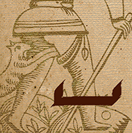
[0] THE FOOL — SPACE
The SPACE. Anything can happen in it. Fill it, leave it open, give it a friend or four, fill a whole page with it if that's what makes you happy! White space is a very important concept in design, including the design of the written word. It allows the eyes — and the mind receiving the information from them — to rest; to take a moment to process, and decide whether to continue.
The space holds unspoken, limitless potential and The Fool steps boldly into this, not knowing what to expect and not letting that deter him. He leaves the past behind and embraces the massive open world that lies ahead of him, ready for whatever story may lie ahead.
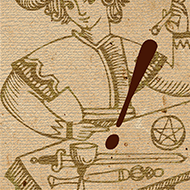
[1] THE MAGICIAN — EXCLAMATION MARK
The EXCLAMATION MARK is a "BAM!" This is the attitude of Le Bateleur, the modern day equivalent of whom would be the "As Seen On TV" presenter hocking snake oil in various guises. The Magician is a show-off: Fireworks, prancing ponies, confetti showers and sequinned assistants — these are the tools of the Magician. Are you hyped yet?? YEAH! Great! I'm gonna lead your children away into a mountain now, sound good? YEA... h?
Who brings the drama? The Magician brings the drama! Allow yourself to be stunned and amazed, while remembering that there is a generous amount of sleight-of-hand and misdirection being applied. Look for what's hidden between the lines; the truth behind the lie.
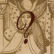
[2] THE HIGH PRIESTESS — QUESTION MARK
Inherent in the QUESTION MARK is a sense of mystery, something The High Priestess knows all about [but she isn't going to tell you.] She is the sphinx at the centre of your inner labyrinth who counters your questions with more questions, koans, rhymes and riddles. knowing full well there are no right answers. Infinitely patient, she is the "Why?" in response to the "why?" — utterly infuriating, but she knows the student must answer their own questions if they are to learn.
And the answers are all there, waiting. Perhaps you aren't asking the right questions.
[3] THE EMPRESS — LEFT BRACKET & [4] THE EMPEROR — RIGHT BRACKET
The Empress and The Emperor are a matched pair, like the LEFT and RIGHT BRACKET (parentheses). This choice of mark is symbolic, rather than functional. The brackets symbolise opening and (en)closing: The Empress is the embodiment of opening to the many and varied pleasures of life; The Emperor sets laws, rules and regulations to mark (close) the boundaries.
Often depicted as pregnant, The Empress encloses new life within her body. The Emperor — the father — encloses his empire under his protective rule. However, taken to extremes, protection and safety can turn into smothering and authoritarianism. At the same time, one without the other leads to nonsensical statements. They are a functional and necessary pairing.
[5] THE HIEROPHANT — QUOTATION MARKS
QUOTATION MARKS indicate that someone is speaking; in this case, it is The Hierophant. He is teaching, bringing down the Word of God to the people. He is a channel for divine inspiration, using dialogue to create a common ground for the meeting of heaven and earth. Quotations also remind us of theatre dialogue, one of the main ways in which early religion was communicated to the "common man". Similarly, the oral tradition of passing down history in every culture. is a very theatrical one [there is definitely some crossover with the Magician here].
The Hierophant isn’t afraid of spelling things out; he’ll even draw you a picture and do a little dance if that’s what it takes to get the message across. Got it?
[6] THE LOVERS — HYPHEN
The HYPHEN joins two separate words together to form a new whole, as well as functioning as a modifier. A prime example of this as expressed by The Lovers would be the hyphenation of last names when partners marry, implying a taking-on of the other’s family, history and even personal qualities [numerologically speaking]. Alternately, it can break words into parts ie. syllables for clarification of meaning or pronunciation. A word may also be hyphenated to allow for more effective use of available space on a page to aid the flow of reading.
The Lovers remind you that, in order to form a cohesive whole, it is imperative to understand how your individual parts work in conjunction with each other, and that sometimes a separation is preferable to a joining.
[7] THE CHARIOT — SEMICOLON
The SEMICOLON joins two separate, but related clauses. Conversely, it separates interdependent concepts. This is very much reflected in the dual pull of The Chariot: Will vs. Imagination. These forces originate from the same source, but they often want to go in different directions at different speeds. Too many full stops — Will — and there is no flow. Too many words — Imagination — and the story becomes unruly. The semicolon is the clutch, reigning them in. With no means of control, these forces will bite at each other until you land up in the metaphorical ditch, scribbling notes in the margin to explain yourself.
The Chariot as semicolon is a hint that some critical editing might help smooth your forward progress. How may things be simplified and sped up by harnessing related ideas to each one another?
[8] STRENGTH — APOSTROPHE
The APOSTROPHE is used to indicate possession, as well as contraction. Does the woman in the Strength card hold the lion's jaws open with force, or is she using the gentle application of her strength to close them? The apostrophe urges you to examine the strengths you possess and see where you, too, can use them to calm the beast. Beware though of becoming the beast to get the upper hand — it might be easier to use animal force, but what delicate nuances are lost in the process? Examine the difference in effect between the words "don't", calmly stated, and an abruptly sharp "do not", to understand how oftentimes, approach is everything.
What strengths do you possess? What excess can be excluded?
[9] THE HERMIT — EM DASH
The EM DASH creates a temporary separation, indicating a break in thought or pause for explanation, much as The Hermit separates himself from society for a period of time to examine his inner world and how it relates to the outer in which he physically resides. This is an abrupt change; not as permanent or forceful as the period, but not as temporary as the comma. The em dash is also used to show an interruption in dialogue, indicating that sometimes a state of hermit-like withdrawal is imposed, rather than chosen e.g. ill health.
As with the correct usage of the em dash, the desire to retreat can be met with confusion and misunderstanding, until it is resolved on the other side and the sentence is allowed to continue. This break is necessary though for proper examination of the self — a deep inhale for the soul.
[10] WHEEL OF FORTUNE — COMMA
The functions of the COMMA are many and varied, like the nuances of fortune we experience in life. A comma indicates a brief pause before continuing with an idea; the Wheel of Fortune pauses too — sometimes unexpectedly! — before continuing on its way. As the comma separates items in a list, so are stages of life, vagaries of fortune and changes in station, separate points on the Wheel. No stop on the Wheel is permanent though; it keeps turning in an endless cycle of ups and downs, as commas set a rhythm when reading.
The shape of the comma is reminiscent of the ticker on the game show wheel — what prize does Fate have in store for you today?
[11] JUSTICE — FORWARD SLASH
The SLASH is commonly used to indicate an either-or choice between options. In life, as in law, sides must be weighed and choices made. In order for the scales to remain balanced, there must be give and take, following on from the ups and downs of the Wheel of Fortune. Oddly enough, the slash can also be used to indicate a refusal to take a definite position, comparative to the "blindness" of Justice. The shape of the slash calls to mind the downward slash of a sword or the bar in the % sign, reminiscent of the balance scales of Lady Justice.
Do you make a balanced, measured choice? Do you elliminate options by slashing through them? Or do you stay blind to maintain the staus quo?
[12] THE HANGED MAN — COLON
The COLON informs the reader that the following proves, explains or simply provides elements of what is referred to before. It is: what it is. It introduces the logical consequence, or effect, of a fact stated before, mirroring the position the Hanged Man finds himself in. The colon is also used to clarify the elements of a set; this allows the Hanged Man to reflect on and describe the choices, paths, twists and turns that led to his position. Finally, the use of the colon in digital time readouts is a reminder that The Hanged Man is on a "time-out".
The colon is a highly functional mark, without overt emphasis or emotion attached to it. The Hanged Man knows that his position is an opportunity; struggling will only make it worse, so he might as well think about how x led to this y.
[13] DEATH — ELLIPSIS
The ELLIPSIS indicates a trailing off into silence and symbolises the 3 Fates governing the past, present and future. Much like Death, it possesses a natural air of melancholy. There is also an uncertainty left in the wake of the ellipsis — will the story continue, and, if so, what follows? We don’t know until we get there. Often, the ellipsis appears just at the point where the story is reaching a climax; the hero is about to make his daring escape; the villain has just revealed his dastardly plan; the engines have failed! But you’ll have to wait 'til next week to find out more. That's life.
The appearance of Death can lead to anxiety over not knowing and not being in control, but the central dot [the present] over Death’s eye reminds us that there is only now. This is where we should focus.
[14] TEMPERANCE — AMPERSAND
The AMPERSAND joins two things and is itself a glyphic rendering of "et", meaning "and". Unlike the hyphen though, these two things remain separate and unique, forming a partnership, rather than the union of The Lovers. It’s a subtle difference, but there is a sense that the Lovers implies a dissolution — like new lovers who get completely lost in each other — while Temperance is a more mature relationship, where the parties involved blend together, while maintaining their individuality. Give-and-take, versus all-or-nothing.
Arguably the most visually poetic punctuation mark, the ampersand depicts the beautiful flow that Temperance brings.
[15] THE DEVIL — UNDERSCORE
The UNDERSCORE is
heavy. Apart from its original function of underlining typed text, it is now most often used to show emphasis when emotion must be conveyed through written words, rather than spoken. This form is so prolific that an underscore placed at the beginning and end of a word is automatically converted to italic script by word processors.
Chaining words together with an underscore — as opposed to leaving spaces between them — is a common naming convention in programming languages.
What is weighing you down? What emotions are you trying desperately to express? And when did the hyphen in the Lovers become a chain that prevents you from moving freely in space?
[16] THE TOWER — INTERROBANG
The INTERROBANG is a new addition to punctuation, offering a less unwieldy option than the "?!" combination. It is the
OMGWTFBBQ of punctuation marks, indicating outrageous disbelief. The Tower indicates nothing if not an excessively dramatic state of events — Shock! Awe! Horror! It isn't always a bad thing. This is the moment where you either reject what has happened and walk away in disgust, or realise that there is so much more going on under the surface than you ever imagined and
omgwtdfbbq please throw me out the window again!
It might not be pretty, it might not be easy, but it is definitely exciting — and may you always live in interesting and exciting times.
[17] THE STAR — ASTERISK
The seven-armed ASTERISK was originally invented as a mark to indicate date-of-birth when printing family trees [and don’t we still make comparisons to stars and birth — ill, blessed, or otherwise?] Many of these records have been destroyed over the centuries, often burning up in parish fires — the tally of village births and deaths generally being kept by the church. While this means that many of us don’t know our ancestral heritage, it also affords us the opportunity to make a new start; write our own history. This mimics the fire and destruction of the House of God (The Tower) followed by The Star. There is also the "Dawning of the Age of Aquarius" — the sign which rules the Star — supposedly heralding the rebirth of mankind.
The modern usage of the asterisk includes the "wildcard" function. The Star is something of a wildcard too — just when you think the blackest night will never end, The Star shines anew. It is the unexpected blessing that can indicate new hope or even a re-birth of consciousness.
[18] THE MOON — INVERTED QUESTION MARK
The INVERTED QUESTION MARK forms part of Spanish grammar. Here, it is used to symbolise the topsy-turvy landscape of The Moon. When you go down the rabbit hole and through the looking glass, everything is backwards and upside-down; a sometimes nightmare-world filled with all your darkest fears. This is the world of the subconscious and is related to the High Priestess through her connection with the moon. It is the sea that exists just barely visible behind her curtain, wherein you can swim or drown.
You’ve discovered the illusion of "answers" and now you have to re-evaluate your internal landscape before crossing back over the threshold of reality.
[19] THE SUN — FULL STOP
The FULL STOP is a more defined break than the comma found in the Wheel of Fortune [the cross-sum of The Sun]. It puts an end to an idea just as The Sun puts an end to the confusion of The Moon. There is simply no arguing with a full STOP! Dreams and nightmares, fears and illusions are left behind to welcome a fresh new day filled with light and clarity.
The Sun offers a mini vacation, allowing you to step away, take a breath and continue when you are ready.
[20] JUDGEMENT — PILCROW
The PILCROW indicates the beginning of a new paragraph and was first used in the Middle Ages, making it a fitting companion to the depiction of redemption and spiritual rebirth shown in the traditional Judgement card. The pilcrow marks the end to a stream of thought; prior to its implementation, text was an endless white river rafting adventure of words without break.
Judgement takes the stop offered by The Sun as an opportunity to distance itself from what has gone before and begin a new way of thinking, being and living: A new chapter.
[21] THE WORLD — LEMNISCATE
The LEMNISCATE is more commonly known as the symbol for "infinity"and is a Mathematical glyph, rather than a punctuation mark. So why choose it here? The World dances outside of the borders of everyday perception; she has escaped the Wheel and has found never-ending freedom in the Mathematical foundations of the universe. She unites word with meaning, symbol with function. Where she moves, poetry becomes equation, equation becomes music and music becomes light.
World without beginning; world without end.